Objective – Create a simple identity system for an automotive-focused industrial design consultancy.
Solution – Keep it simple yet memorable while referencing the excitement of smashing the gas!
The Problem – The LOVARO.mobility group investigated what an e-bike would look like if designed from the ground up around local transportation consumers’ real needs.
The research found that most “urban e-bikes” force people to bend behavior around stubborn engineering adapted from older formats like mountain or road bikes. These recreational formats fail to meet the practical needs of people running errands, shopping, commuting to work, riding with kids, or socializing with friends. Through interviews with mainstream audiences, the team learned that poor product-market fit keeps potential adopters stuck in their cars.
Our Solution – ROME blends trike-like safety with bike-like agility & ride performance. The platform’s unique mix of 'smart vehicle' drive systems maximize stability and traction, providing elevated safety and comfort for everyday errands & activities with passengers, kids, or cargo. The platform efficiently scales across new models, targeting different local transportation segments' unique needs.
ROME – V2 targets couples and professionals in medium-density neighborhoods and is designed to maximize the potential of the protected bike lane.
BRAND STRATEGY
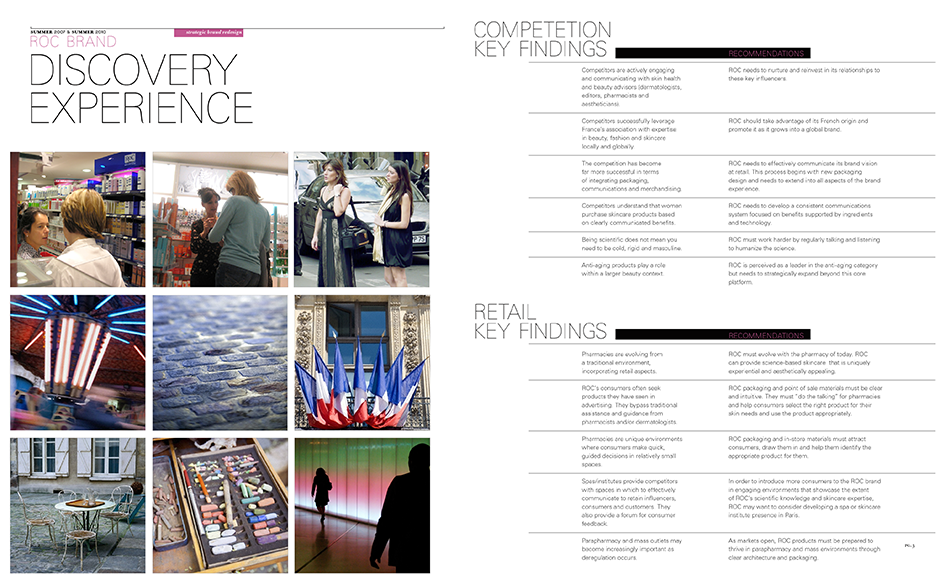
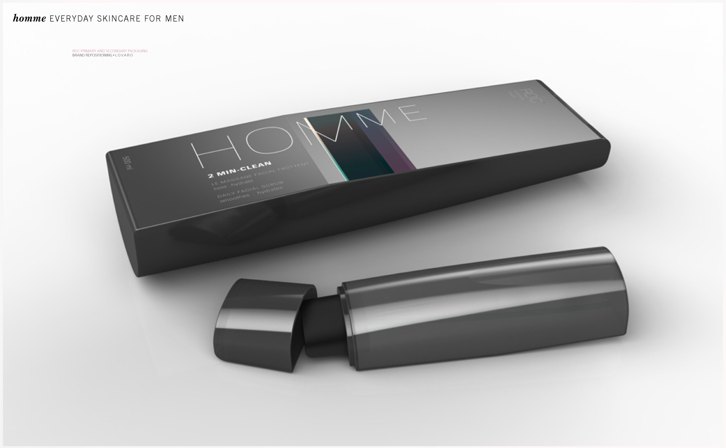
Objective – Johnson & Johnson tasked LOVARO with developing a new brand identity for its classic French skincare line.
THE HEURISTIC REVOLUTION
Solution – Finding optimal solutions to individual needs is nearly impossible in an era of overwhelming noise and distraction. We often rely on heuristic methods to speed up the process. We let mental shortcuts and fractured soundbites ease the burden of making confusing decisions.
Believing that "green is good, but science is better," ROC renders clinically formulated solutions that deliver tangible results that a woman can see and feel. ROC keeps its promises through systematic dermatological research, empirical artistry, and the scientific method. This process develops powerful formulas proven to solve actual skin conditions. ROC rejects the heuristic shorthand lulling the market, offering online access to skincare specialists who help customers find sensible solutions appropriate for their unique needs.
Objective – Johnson & Johnson tasked LOVARO with developing a new brand identity for its classic French skincare line.
Solution – LOVARO introduces ROC to the masses as the embodiment of a measured modern beauty.
ROC was an honest solution that addressed the real needs of various skin types. Inspired by mid-century celebrities and socialites who suffered from the harmful skin irritations caused by harsh stage makeup, a Parisian pharmacist developed the first-ever line of hypoallergenic cosmetics. ROC pioneered the natural, sensitive, and effective skincare category with pure formulations devoid of the irritating fragrances, pigments, and oils persistent in products of the era.
ROC delivers the promise of beautiful skin where no appointment is necessary to achieve invigorating results. Grounded in science and built on human values, ROC’s dermatologists and skin care professionals develop sensible yet powerful solutions for various conditions and desires. Products are created, measured, and tested rigorously in scientific laboratories. The efficacy of each offering is at the core of ROC’s identity, guiding its innovative skincare philosophy.
Riding the edge between clinical and captivating, LOVARO puts forth a clean visual brand aesthetic that captures tomorrow’s traditions. We infuse the essence of clinical innovation with the pure spirit of that bygone mid-century era. It communicates accessible dermatology that delivers results without scraping for attention.
Objective – The challenge was to develop a strategic brand position for an iconic but stalled property. We aimed to carve out a unique presence in a market defined by intense competition.
Solution – To remind customers who BlackBerry is and inspire future customers, we must first define the brand’s core mission and target markets. Critical to this awareness is a deep insight into legacy customers, cross-over consumers, and the discovery of unique market opportunities that will drive product development.
From rational to emotional and formal to casual – we look to understand Macro Trends that shape the current market and uncover Micro Trends that point to where it will go next. With a robust wayfinding system, BlackBerry can begin influencing and shaping unique experiences with products and communications that rebuild its position.
Process – We interviewed diverse content creators who transcend geographic and cultural borders. We interviewed cosmopolitan ‘hyper users’ in New York, Milan, and Tokyo, looking for demanding usage scenarios to find the most applicable insights. Providing a middle-market counterpoint, we studied groups in suburban Milwaukee to balance and ground our findings.
Moving further, we connected BlackBerry to the highly developed, rapidly changing, fashion-forward eyewear market to explore how design practices, materials, industrial processes, and craftsmanship can bring value into the brand’s touch-points. At the time of this project, sophisticated CMF techniques were uncommon in tech, yet significant opportunity existed to re-focus BlackBerry around higher quality objects of enduring beauty.
Objective – The challenge was creating a unique industrial design identity for the BlackBerry brand that is instantly recognizable and distinctively forward-looking.
Solution – At its core, BlackBerry speaks to an elite group of talented visionaries. These individuals are leaders and shot callers. They financially iterate and next-level artists. They understand their mobile platform is only as good as the lock that secures their data. They arm themselves with the tools necessary to protect their digital valuables from those who aim to steal them.
LOVARO presents a series of design concepts that emphasize modernity, confidence, and security. Delivering form language that stylistically links BlackBerry with contemporary culture means refining elements and micro-sculpting even the most minor details. Building on a powerful new operating experience, these devices elevate materiality and form to become objects of lasting value.
Objective – Within a crowded field defined by strong competitors, the challenge was to carve out a unique visual identity and dynamic interactive experience that captured the BlackBerry Brand.
Solution – Empowering users to individualize their experience, LOVARO proposed two visual languages driven by a single OS.
The Financialis – Focused confidence and controlled mindset. A pure, no-gimmick visual design language appeals to self-determined legacy customers.
Humanistic Framework – Approachability without compromising personal power., Humanistic Framework targets the growing crossover, multi-tasking user base.
Objective – In 2011, Renault Automobiles, together with Designboom, hosted a competition to reimagine the iconic Renault 4. This design competition fielded over 3,000 entries from 92 countries, rewarding three overall winners. Lovaro was one of them.
The competition asked participants to recapture and expand on the Renault 4’s image as a reliable and enjoyable means of transportation with a refreshed and contemporary interpretation. The original Renault 4, designed by former Renault president Pierre Dreyfus, was once the third bestselling car in the world, known and loved by people around the globe.
Solution – Looking back on the history of the Renault 4, there’s plenty of inspiration. Fifty years later, with over eight million units sold, Renault wanted to recapture the spirit of the versatile vehicle. With a focus on brand and experience, LOVARO delivered 4 EVER, a design rich in simplicity, beauty, and playful character.
Initially designed for simplicity and versatility and with a positive outlook on life, the 4 EVER concept strives to celebrate these themes with a contemporary design expression. The original 4 blended fun with functionality; this confluence was our baseline starting point.
The 4 EVER is constantly learning and adapting from its environment, modifying itself to meet the daily needs of driver’s diverse use cases. With interchangeable construction features, this concept delivers a flexible configuration with many possibilities, maximizing the number of end-use options. Exterior and interior fixtures, panels, and details can be easily replaced with modified solutions to suit individual uses and desires.
Objective – Porsche Next Design Challenge: Designs inspired by the 911.
Solution – Few experiences are as hair-razing as the razor-edge thrill of an Ice Boat skating at top speed over fresh ice. Traveling at speeds up to 100 miles per hour on frozen waters demands precision and performance that only Porsche can offer. Tapping into the rich history and capability of the Porsche 911 and utilizing performance composites and engineered materials, LOVARO harnesses the wind to express the most thrilling brand experience.
Objective – One night over drinks with a colleague after work an idea is born. A modern take on a traditional cane turns a practical tool into an eye-catching accessory and is the foundation for a promising business. Aids For Daily Living asked LOVARO to bring their vision into the real world.
Solution – Meaning “with great care” in Danish, Ohmu’s Baltic Birch cane is designed with an easy-to-grip handle, a high-strength yet lightweight aluminum shaft and a cushioned patented tip. The handle grip also keeps the cane from falling over when leaned against a wall. The cane is inspired by the efficiency of Scandinavian furniture and the glossy aesthetic of high-end bicycles.
Objective – JABRA asked LOVARO to develop a strategic design language for the first in a series of supra-aural headphones, to define their Music & More value proposition, and to elevate them as a credible music brand appealing to urban-focused consumer segments.
Solution – Music uniquely shapes how we see our world. We find a deep connection to the sounds that move us most. Moving us with nothing more than vibrating energy, it provides common references, perspectives, and connections to friends and strangers alike.
Our musical identities are comprised of a diverse range of styles, rhythms, soundscapes, and genres. This versatility in the face of individualism drives JABRA to create powerful tools that boost quality social experiences and unique personal expressions, enabling us to live life to its fullest.
Music & More – How does a relatively generic phrase manifest into a category-leading product? By imbuing it with content and functionality that enhances customer’s lives.
The full audio experience in life encompasses a landscape rich in diversity. It is made up of a verity of sound sources and is a blend of music, communication, environmental sounds, noise, and silence. Jabra headphones adopt this nature by mixing sound from the local environment into the headphone audio feed.
Music is typically organized into patterns that have both pitch and rhythm. As individuals, we quickly distinguish between noise – random and disorganized sounds – and music. Harnessing this law, IMMIX allows listeners to hear sound from the built-in microphones blended with their audio content. This enhances the listening experience by creating a soundtrack that is adapted to their particular use context. It focuses listeners in sound content, allows them to participate in the social world around them, keeps them safe by hearing a good portion of the sound environment around them, or enables isolation from the environment to concentrate on a book while in a crowd.
STRATEGY, BRANDING, INTERIOR RETAIL CONCEPT
Objective – Create an identity and interior design for PRONTO by Polaroid, a brick-and-mortar Instagram photo enhancement franchise business.
Pronto is a digital imaging and enhancement business helping customers get the best possible images from the photos they take. Catering to Instagram aspirations and targeting those who want more from their memories, PRONTO software and in-store “lab coats” professionally color correct, crop, and edit your images to enhance the moment and create professional-quality images of lasting beauty.
Solution – PRONTO embodies the nostalgia and glamour of masterwork photography in an ultra-contemporary “modernist meets a retro victorian chic environment.
BUSINESS CONCEPT, BRAND IDENTITY & RETAIL EXPERIENCE
Client: Rebecca & Nani Grenell
Photographer: Michael Erdman
Illustrator: Morgan Corum
Design Assistant: Dawn Lozzi
Concept – La Causa, The Cause, or LA, CA, USA is fashion & consciousness. It is a reverence for the open sky and warm light that floods Los Angeles. It is an interchange where ocean and desert rush upon distant mountains to spill over neighboring bungalows and palm-lined boulevards. We are a response to the disappearance of fresh air and clean water. We are a reaction to the possibility that nine billion of us might someday be looking for something new. La Causa is created in honor of the unrecognized (out of sight/out of mind) environmental, social, economic, and political realities that we face together. It is a realization that style is first, and so is sustainability.
Our Solution – In time, we will offer an entirely sustainable line of clothing that is uncompromising in its design. We work towards sustainability, bit-by-bit, as we learn and grow both on personal and institutional levels, to positively affect life in our neighboring communities. We find inspiration in the people that surround us and in the issues in their lives. We seek to align ourselves with ideas that are important for collective action, attempting to leave things a little better than we found them.
Our Inspiration Now – Ride a Bike! Save gas & meet your neighbors. We neither claim to be expert bikers, nor do we presume to be sustainability specialists, either in our personal lives or in the production of our clothing. We are simply trying to do the best we can considering the circumstances we are faced with. We realize that taking our bike or LOVARO to the store, even just once a week, can have profound and lasting impacts on our neighborhood, the city, the world, and us.
Exhibition design competition entry for the Triennial of Contemporary Architecture in Portugal, Brazil, Scandinavia, Switzerland, and Africa to be held at the Museu da Electricidade in Lisbon Portugal.
Objective – The challenge was to create a spatial experience that expresses the concept of a ‘Connected World.’
Solution – Science, and technology continually define smaller and more numerous volumes, structures, and pathways that often defy rational expectations of the universe. Our perceptions of time and space continue to collapse in upon themselves, re-contextualizing the human experience of ‘remoteness’ and ‘closeness.’ An evolution towards technological omnipresence rearranges our concept of boarders and socio-cultural divisions. They allow ideas to free flow through a vast proliferation of previously unimagined virtual conduits.
In Connected World, “Strings” bind and bend our perceptions of space into unimagined new realities and dimensions. The compact spaces created when condensing space and time through unifying closed-loop geometry creates a place for cultures to mix and ideas to transcend beyond the realm of static borders. Within this landscape, we can locate emerging trends and themes in architecture.
LOVARO designed two contiguous digital membrane displays that define the exhibition program. The continuous Mobius Strip inner membrane is composed of a flexible digital OLD screen. Here is where visitors see high-resolution idealized visions of each architectural project. This inner membrane encourages physical permeability and re-imagined space-time by allowing the participant to interact with it, physically bending and moving it into new spaces. The outer membrane is a space for low-resolution portraits of the buildings as they actually exist. Somewhere between the two – the idealized and the realized – lies the soul of Architecture in this new millennium.
EXHIBITION CONCEPT, CREATIVE DIRECTION & GRAPHIC DESIGN
OMA+AMO+MOCA=OMAMOca
Objective – As an independent Creative Director at R3 LAB in Los Angeles, Robert helped the Museum of Contemporary Art at the Geffen Contemporary develop OMAMOca Rem Koolhaas: Architecture of Identity.
Solution – The identity program for OMAMOca explores how, thorough examination and contextual scrutiny, Rem Koolhaas and his twin agents OMA & AMO work to identify and provide the essential elements of cultural unity. A series of Rorschach tests highlight the process of definition, analysis and societal reflection that Koolhaas and his group undertake to form the core principle of Architectural Identity. Built Structure, Networks, Culture, Commerce, and Human Behavior are the metrics through which appropriate solutions are empirically identified.
Objective – Re-brand the European discount airline Ryan Air.
Solution – LOVARO proposed a comprehensive brand overhaul, renaming the airline Flyryte, and focusing on the potential for customer interactions, social networking, and shared experiences. We repositioned the company as the impulsive, yet no-frills airline that it truly is.
The concept behind the visual identity blends this research with Shakespeare’s spectacular ‘A Midsummer Night’s Dream.’ Understanding the ‘summer dream’ as an opportunity for spectacle and entertainment, the brand captures the magic, escape, and folly of a Flyryte flight. It is an emotive touchstone to captivate the audience and transport them into a mythical world of transit.
Flyryte is for the shrewd traveler who believes that the journey is the destination. That travel is a place where paths cross, people fall in love, inspiration sparks with the exchange of new ideas, and living in the moment opens the door to comprehend unknown realities.
LOVARO designed elements that promote the likelihood of customer interaction and chance encounters. These products are sold on the aircraft, at the airport or in travel stores. With them, the airline can infiltrate a competitor’s flights by placing their branded merchandise in the hands of customers flying on competing airlines. Thus fulfilling Puck’s mischievous task, and string the pot of competitive airline branding.
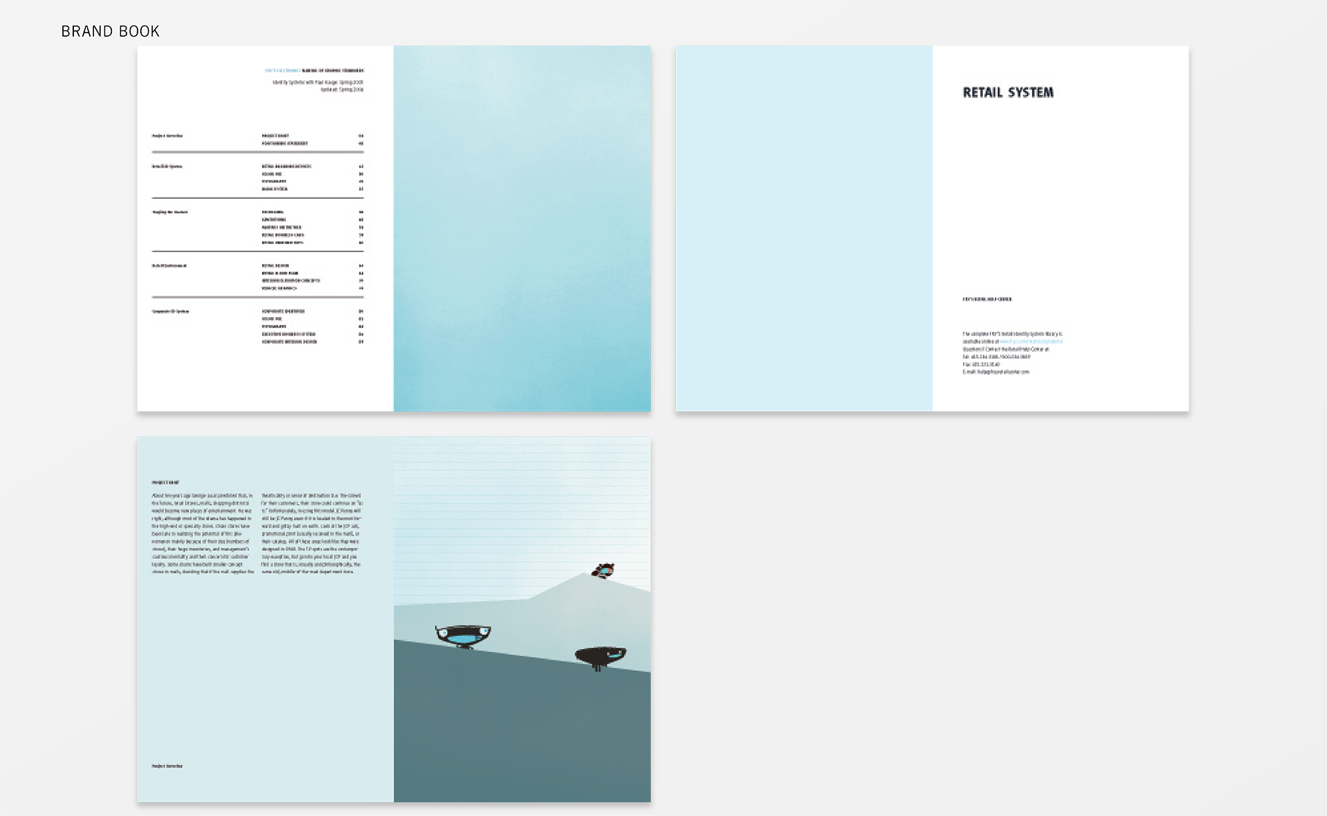
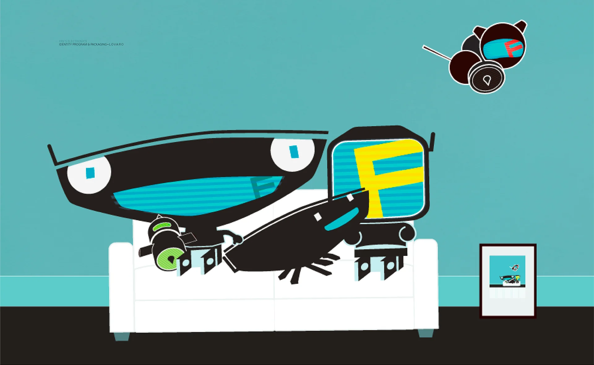
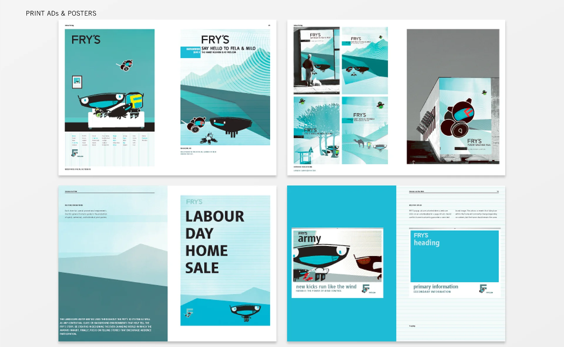
Objective – Fry's Electronics is a big-box store and retailer of software, consumer electronics, computer hardware and more. The objective was to create a new retail identity system reflecting their strong position in consumer electronics.
Solution – LOVARO developed a visual identity system based in Avatecture, creating a family that stewards the FRY’s brand. FRY’s characters continually relate themselves to their customers in entertaining, engaging, and educational ways.
Objective – S.T. Dupont asked LOVARO to create a men’s fragrance and an accompanying line of personal accessories.
Solution – Reflecting on the complex and changing values of today’s world and the luxury nature of S.T. Dupont’s clientele, LOVARO presents a CLOAK for men.
Objective – BeautiControl tasked LOVARO with developing a line of compacts for their Mineral Blush and Shadows collection.
Solution – The identity program for BeautiControl cosmetic packaging is based on the thought that "Natural beauty is all around us.” BeautiControl believes that natural beauty is found both inside and out. It is grounded in a style that authentically suits individually, without fuss or fluff. It is about what feels good, what excites the soul and what looks right when you look in the mirror.
Objective – Early in their career, Allen and Robert met while working at Smart Design, a prominent industrial design in New York City. While there, the team completed a variety of OXO kitchenware design programs.
Objective – The challenge was to define a distinctive design language recognizable as Burton, with a high “cool factor” and appeal to ever more experienced riders.
Solution – The team designed a series of innovative snowboarding tools that deliver a seamless and effortless on-mountain experience. Searching for a unique design language, they incorporated crisp organic modernism defined by softer and safer natural shapes that are comfortable to hold, easy to use, portable, and connect the rider with the natural world around them. The tools are popularly known as the ‘fastest tools on the hill,’ meaning that with them, riders can tune their gear quickly, without having to miss a single run.
PHOTOSMART PRINTER SERIES
As an Industrial Design Director at Smart Design Allen led the team that created the HP Photosmart printer series, HP's best-selling consumer product ever.
L O V A R O
A multi-disciplinary product design, creative direction, and branding agency with 10+ years of experience leading projects within the luxury beauty, technology, transportation, and lifestyle industries.
A L L E N & R O B E R T
In 2011, Allen Zadeh and Robert Foote III founded a human-centric design studio to create process-driven strategy, direction, and design. The team translates critical learning into tangible results with outcomes – as beautiful as they are helpful – that transform markets, advancing the human experience.
Their individualized “small shop” approach fosters dependable client relationships, acute attention to detail, and better design outcomes. The studio consults with companies on a contract basis, bringing focus specialists into the team when required to deliver outstanding results. LOVARO's field of expertise includes design strategy, naming, graphic identity, transportation, consumer electronics, and brand experience design.
C L I E N T S
Beauti Control
BlackBerry
Bloomberg
Burton
Coty
Direct TV
Hulet Packard
Imagine
Intel
Inter Parfums
Jabra
Johnson & Johnson
Mack Trucks
Microsoft
Neat
Nike
Nissan
NYC TLC
Omhu
OXO
Panasonic
Porsche Design
P&G Prestige
Renault
Timberland
Toyota
Volvo Trucks
C O N T A C T
225 West 36th St.
New York, NY 10018
Email